Secrets of Building a High Conversion Website (1)
A high-converting landing page boils down to one thing...
— Alex Garcia 🔍 (@alexgarcia_atx)February 1, 2024
But most people get stuck assembling blocks of design elements and competing headlines that don't drive action.
And ppl leave your site not knowing what, why, and how you do what you do.
So, here are 5 frameworks to fix…
Your fancy website design is killing your conversions!
— Namya @ Supafast (@namyakhann)October 1, 2024
The main goal? Visitors → Customers
But most sites let complex designs destroy this.
Here are 7 modern design trends for MAX conversions:

Personally we use framer for all our sites, cause they are simple to design. You can use wordpress or wix, whatever is the choice, a great landing page creation is an art and science. Here are few resources we recommend for you to go through before creating landing pages
Resources
- Marketing Examined:How To Create A Landing Page That Converts Like A Cheat Code
- Marketing Examined:The Anatomy Of An Above The Fold That Earns The Scroll
- Marketing Examined:5 Ways To Inject Social Proof Into Your Landing Pages
Simple formula to create catchy Headlines
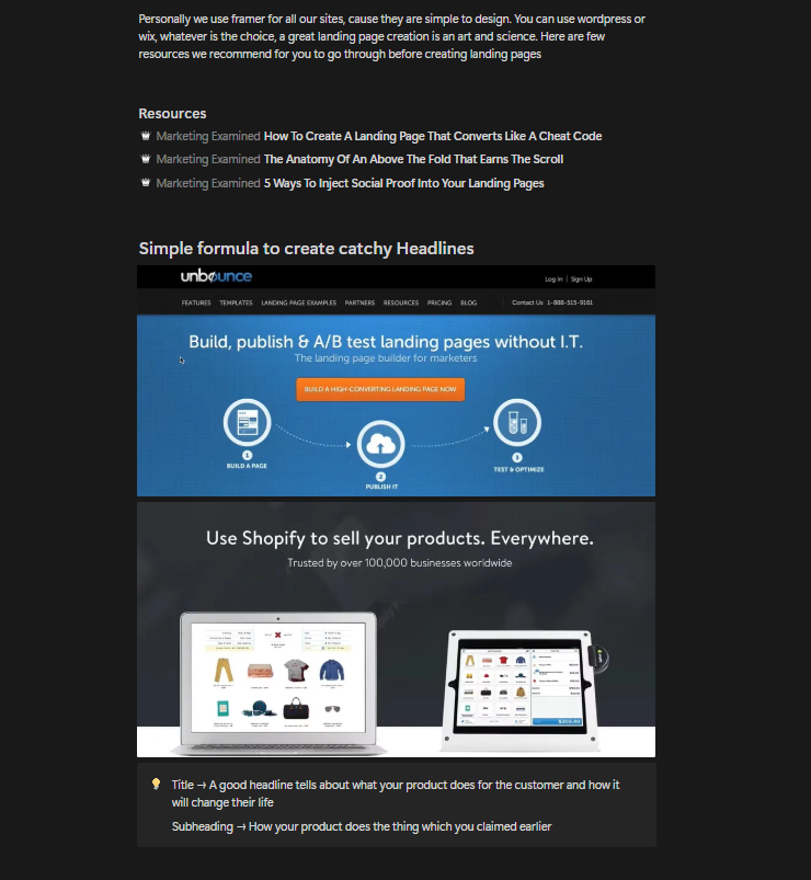
Title →
A good headline tells about what your product does for the customer and how it will change their life
Subheading →
How your product does the thing which you claimed earlier
Steps
- Write atleast 10 variations for your headline, then group similar ones. Pick one from each group
- Ask people to choose which one is catchy - use social media polls
- Whichever headline people liked the most use it
You can also use A-B testing tools like VWO, to see which headline appeals to your users the most. Sometimes the headline suggested by your social media followers might not work with your customers, cause the persona is different. Also, headline that works in one country might not work in another, due to cultural differences. in these cases VWO like tools come in handy
5 Landing Page Headline Formulas You Can Test Today
Writing a high-converting landing page headline can be tough. Why force yourself to write headline copy from scratch when you've got 5 headline formulas
Read more →
41 Engaging Examples of the Best Headlines to Rally Your Audience
Before you even think about writing a piece of copy, spend 15 minutes thinking about the most important part. The best headlines are critical to success.
Read more →Landing Page
Framer has a great collection of landing page templates to get started
Free & Premium Landing Page Templates — Framer Marketplace →Features of a Good Landing Page
- 1.
If you are standing 10 feet away from the screen, you should know where to click.
- 2.
Not more than one CTA & no carousels
- 3.
Keep it simple - make it clear where should user be clicking
- 4.
Contrast your Button, Green color for button works best, Orange the second best
- 5.
First step, lower barrier of entry - give freebies, collect emails, collect leads, freemium signup
To even lower the entry barrier, collect only email id
Every page and everything on your webpage and app pages should have a what to do next thing
You don't want a dead page in your website, if there is remove it or improve it
Button Text Examples
Button text should be to make you curious. Example:
- ✓ Test it out
- ✓ Try it for FREE
- ✓ Get the Offer
- ✓ Download
- ✓ Login
- ✗ Continue to make it feel like oh god there is another step
- ✗ Submit is bad because most people think that they are giving something
Examples of companies with an awesome call to action
- 1.Groupon - Accomplishes successfully the "Above the fold" idea - the call to action is in the top part of the page
- 2.AppSumo - Gets you to sign up right away
- 3.KISSmetrics - Gets you to put in your website URL, and log in through Google
Examples of companies who miss the mark
- 1.SendGrid - It's not clear what they want you to do, and there are too many options
- 2.SalesForce - They use a carousel which makes their objective unclear
Below headlines include the Testimonials and social proof, then your offerings and again CTA
This page contain critic ideas about what they liked about pages best and what not →Emily Omer, Paul ParkThe best landing page designs to inspire your next layout
Remember your metric isn't to make cool website but to make a converting one
Appsumo Kopywriting Kourse is a good place to start learning about website copywriting, or just refer to these notes, these will be enough
A/B Testing
100 Conversion Optimization Case Studies
If you're a marketer, you're undoubtedly looking for techniques to optimize your website for better conversions.
🎯 Visit Resource →
The Ultimate Guide To A/B Testing — Smashing Magazine
A/B testing isn't a buzz term. A lot of savvy marketers and designs are using it right now to gain insight into visitor behavior and to increase conversion rate.
📚 Read Guide →Even though every A/B test is unique, certain elements are usually tested:
- •The call to action's (i.e. the button's) wording, size, color and placement.
- •Headline or product description,
- •Form's length and types of fields,
- •Layout and style of website,
- •Product pricing and promotional offers,
- •Images on landing and product pages,
- •Amount of text on the page (short vs. long).
If you want to build your muscle into landing page AB testing, this will be a good test for you
GuessTheTest
Money-making A/B test case study results, ideas, and insights. Take gamified split tests to inspire and validate your testing ideas with objective, real-life results.
✓ Try GuessTheTest →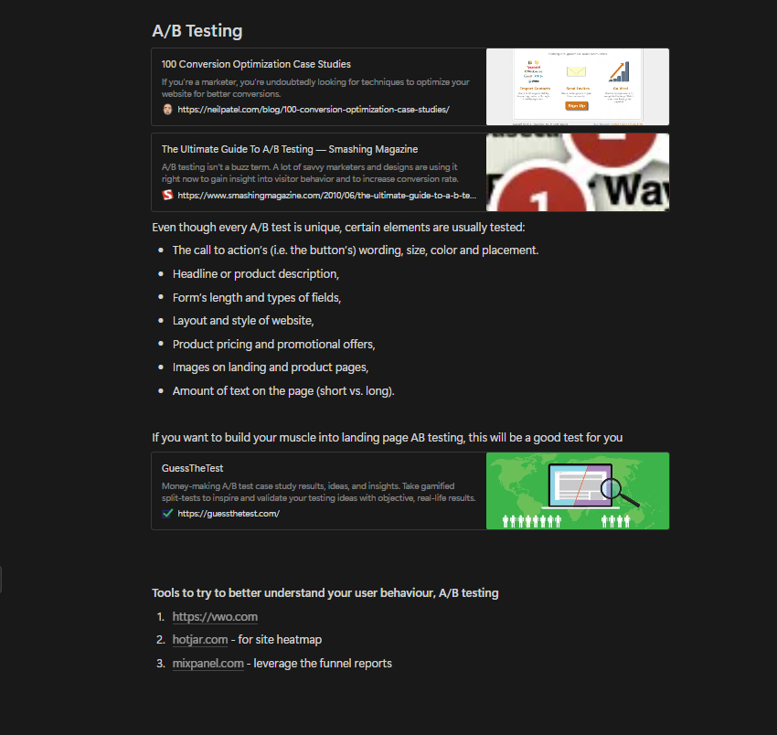
Tools to try to better understand your user behaviour, A/B testing
- 1.https://vwo.com
- 2.hotjar.com- for site heatmap
- 3.mixpanel.com- leverage the funnel reports
General Principles
- 1.Clear Purpose: Define a single, clear purpose for the page to guide users.
- 2.Consistent Branding: Align visuals, tone, and style with your overall brand identity.
- 3.Simplify Layout: Keep the design clean and focused on the core message.
- 4.Clarity Over Creativity: Prioritize clear messaging over overly creative but confusing designs.
Above-the-Fold
- 5.Compelling Headline: Write a headline that addresses the user's key need or problem.
- 6.Supportive Sub-headline: Use a sub-headline to expand on your promise in 1-2 short sentences.
- 7.Eye-Catching Hero Visual: Include a hero image or video that reinforces your core message.
- 8.Primary CTA Placement: Place a prominent, high-contrast CTA button above the fold.
- 9.Trust Indicators: Add elements like client logos, certifications, or awards to build credibility.
- 10.Quick Answers: Ensure users can answer "Where am I?" and "What can I do here?" within 5 seconds.
- 11.Visual Balance: Balance text and visuals to create a harmonious design.
- 12.Contrast and Visibility: Ensure text contrasts sharply with the background for easy readability.
- 13.Directional Lines: Use visual elements like arrows or lines to subtly guide users toward the CTA.
- 14.Short Copy: Keep above-the-fold content concise—get straight to the point.
Headline and Copy
- 15.Direct Tone: Write as if speaking directly to the reader—avoid corporate jargon.
- 16.Value-Focused Headlines: Highlight what users gain, not just what you offer.
- 17.Specific Benefits: Replace generic claims with measurable results (e.g., "Boost ROI by 30%").
- 18.Address Pain Points: Show empathy for the user's challenges and position your solution.
- 19.Use "You" More: Speak to the user's perspective by using "you" instead of "we" or "us."
Visual Hierarchy and Layout
- 20.Strategic White Space: Use empty space to draw attention to key elements and reduce clutter.
- 21.Readable Fonts: Opt for simple, legible fonts with sufficient contrast against the background.
- 22.Logical Flow: Arrange sections in a logical sequence—problem, solution, proof, and action.
- 23.Visual Anchors: Use icons, images, and lines to direct attention to CTAs and key messages.
Hero Section
- 24.Promise in Headline: Clearly state what users can achieve with your product/service.
- 25.Visual Support: Use images or videos to complement your message (e.g., product in action).
- 26.CTA Copy: Use action-oriented phrases like "Start Saving Now" or "Try It Free."
- 27.Highlight Benefits: Focus on immediate value, such as "Save 10 hours a week."
- 28.Subtle Secondary CTA: Add a secondary CTA as a hyperlink or ghost button for lower commitment.
- 29.Contextual Images: Use visuals that directly relate to your product or service.
- 30.Value Proposition Refinement: Highlight the specific pain point your product solves.
- 31.Headline Hooks: Include curiosity-driven hooks like "The Secret to [User Goal]."
- 32.No Clutter: Avoid crowding the hero section with unnecessary elements.
Body Copy and Messaging
- 33.Target Personas: Tailor the messaging to a specific user persona's needs and goals.
- 34.Storytelling: Use relatable anecdotes or examples to make your solution more compelling.
- 35.Actionable Copy: Use verbs that inspire action, such as "Discover," "Achieve," or "Simplify."
- 36.Avoid Fluff: Keep paragraphs short and remove unnecessary words or phrases.
- 37.Use Bullet Points: Present benefits and features in concise bullet points for easy scanning.
- 38.Second-Person Writing: Use "you" and "your" to engage readers personally.
- 39.Power Words: Incorporate persuasive words like "proven," "exclusive," or "guaranteed."
- 40.Avoid Jargon: Write for clarity, avoid industry-specific terms your audience may not understand.
- 41.Scenarios and Examples: Add relatable examples that illustrate the product in use.
Features and Benefits
Social Proof
- 50.Testimonials: Feature quotes that highlight specific benefits or outcomes.
- 51.Reviewer Details: Add names, job titles, and company logos for credibility.
- 52.Case Studies: Share brief success stories with tangible results.
- 53.User Numbers: Showcase stats like "Trusted by 10,000+ marketers."
- 54.Expert Endorsements: Include quotes or mentions from industry experts if available.
- 55.Ratings Summary: Include a quick summary of your average rating (e.g., "4.8/5 on G2").
- 56.Visual Metrics: Use stats like "10,000+ downloads" or "5,000 customers worldwide" as visual elements.
- 57.Influencer Endorsements: Highlight quotes or posts from industry influencers.
Call to Action (CTA)
- 58.Action-Oriented Text: Replace generic CTAs like "Submit" with "Get My Free Trial."
- 59.Multiple CTAs: Add CTAs at the beginning, middle, and end of the page for easy access.
- 60.Urgency Language: Use phrases like "Limited Offer" or "Ends Soon" to create urgency.
- 61.Visual Prominence: Make CTA buttons stand out with bold colours and ample spacing.
- 62.Micro-copy: Include reassurance, such as "No credit card required" near CTAs.
Visual Design
- 63.Consistent Colours: Use a colour palette that complements your branding.
- 64.Minimal Stock Photos: Use real product images or authentic user photos over generic visuals.
- 65.Directional Cues: Use arrows, lines, or gaze direction in images to guide users to CTAs.
- 66.Scannable Sections: Use headings, subheadings, and dividers to break up content.
- 67.Above-the-Fold Visual Focus: Ensure all critical information is immediately visible.
Information Flow
- 68.Problem-Solution-Proof: Start by identifying the user's problem, offering a solution, and proving it works.
- 69.Logical Sequence: Ensure content flows naturally from one section to the next.
- 70.No Overwhelm: Avoid crowding the page with too many choices or unrelated content.
Emotional Appeal
- 71.Empathy Statements: Begin with phrases that show you understand the user's challenges.
- 72.FOMO Triggers: Use scarcity tactics like "Only 3 spots left."
- 73.Positive Framing: Highlight how life improves with your solution, rather than dwelling on negatives.
- 74.Aspirational Copy: Frame your product as a tool for achieving a dream or goal.
- 75.Urgency Visuals: Add countdown timers for time-sensitive offers to create urgency.
Objection Handling
- 76.Answer FAQs: Address common doubts directly within the body copy or an FAQ section.
- 77.Guarantees: Offer risk-free guarantees like "30-Day Money-Back Guarantee."
- 78.Transparent Pricing: Clearly explain costs and eliminate hidden fees.
- 79.Customer Support: Highlight access to live chat or other support options.
Engagement and Interactivity
- 80.Interactive Elements: Add sliders, quizzes, or calculators to engage users.
- 81.Video Content: Include short product explainer videos for dynamic storytelling.
- 82.Chat Options: Integrate chat widgets for immediate query resolution.
Visual Content
- 83.Faces Over Objects: Use photos of people for emotional connection.
- 84.Infographics: Include charts or visuals to simplify complex information.
- 85.Animation: Use subtle animations to guide attention without overwhelming.
Scan-Focused Design
- 86.F-Pattern Content: Align key text to follow natural F-pattern eye movement.
- 87.Bold Intro Paragraphs: Start sections with bold, concise summaries.
- 88.Highlight Key Phrases: Use bold or colored text for emphasis on benefits.
Closing the Deal
- 89.Bottom CTA: End with a strong final CTA and reiterate the primary benefit.
- 90.Social Proof: Re-emphasize testimonials or awards at the end.
- 91.Exit Popups: Offer discounts or freebies to hesitant visitors.
Differentiation
- 92.Unique Selling Proposition: Clearly state what sets you apart from competitors.
- 93.Awards and Recognitions: Highlight accolades to build trust.
- 94.Localized Messaging: Adapt messaging for different regions or demographics.
Personalization
- 95.Dynamic Content: Show personalized CTAs or messages based on user behavior.
- 96.Tailored Testimonials: Feature testimonials from users similar to your target persona.
Final Touches
- 97.Proofread: Ensure there are no typos or grammatical errors.
- 98.Coherent Design: Verify visual consistency across the page.
- 99.Engaging Tone: Maintain a conversational, approachable tone throughout.
- 100.User Story: Close with a user success story or an aspirational outcome.